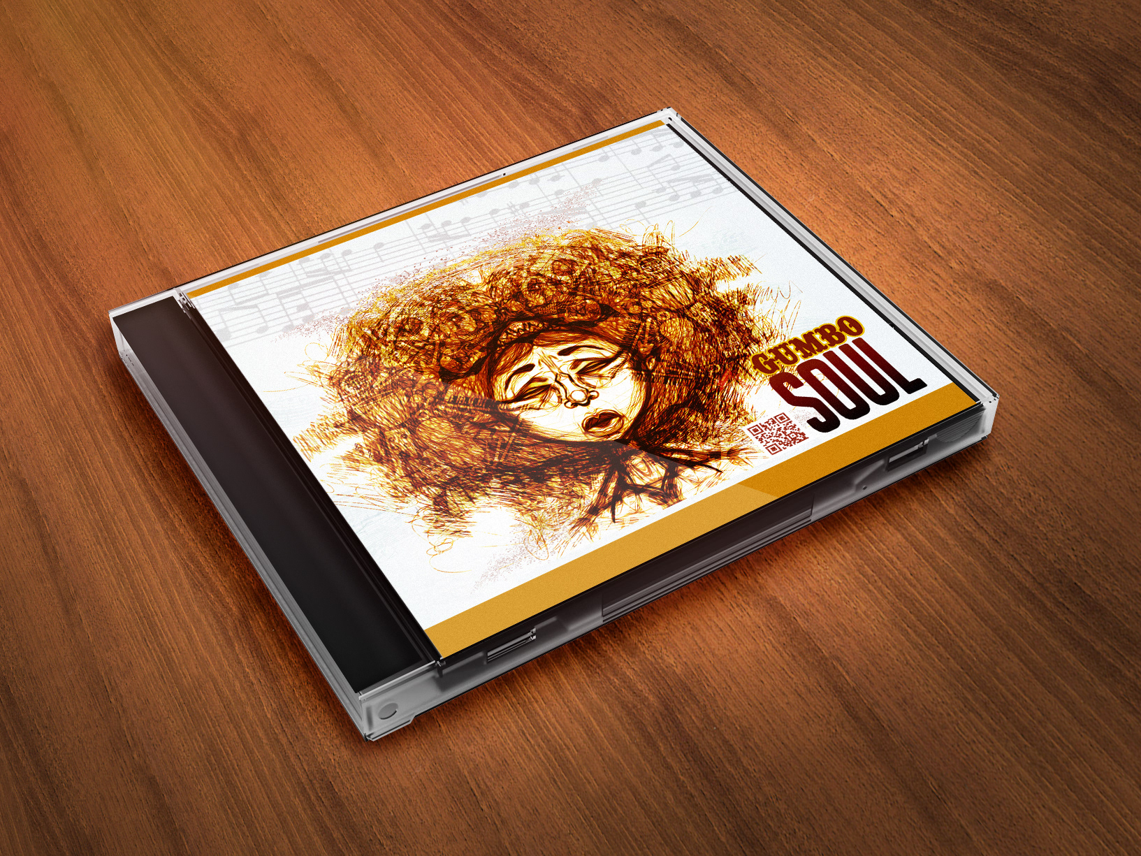
The Idea was to show the client what the completed piece would look like before it was printed. Also how it would fit for her needs. She was totally pleased. This effect was achieved using photoshop.
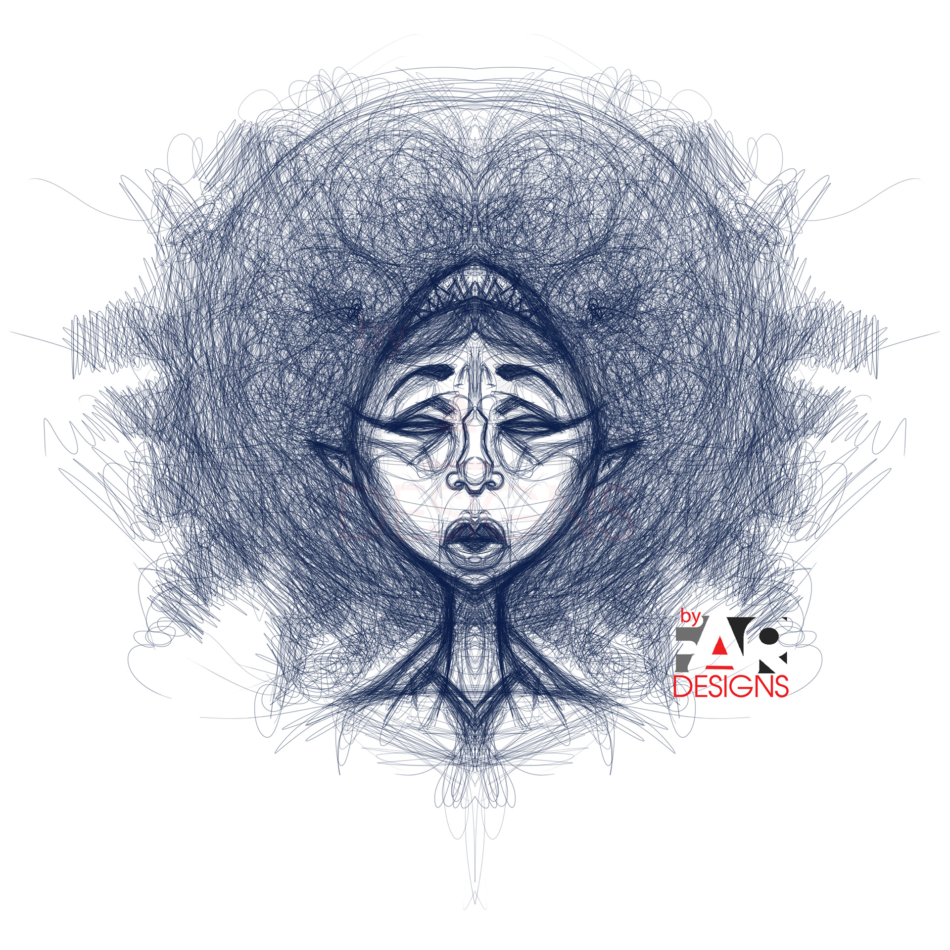
This was the sketch presented to the client regarding what was requested. She loved the Sketchy loose look so much that she insisted on incorporating that into the final look. This look was done using Sketchbook Pro, pencils.

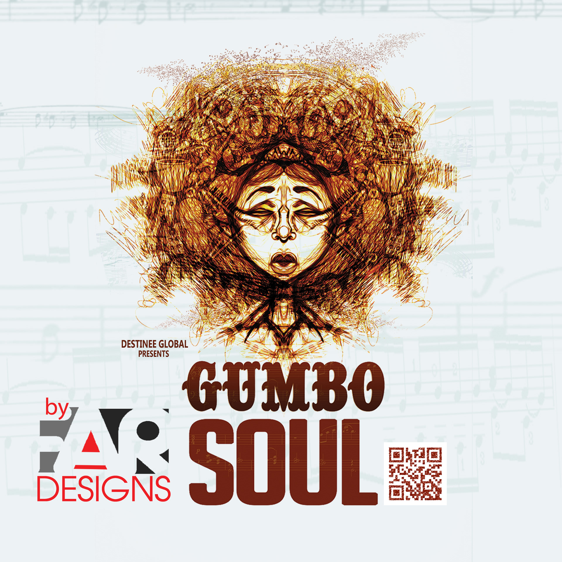
Enhanced the color with a few elements halftone dots and a muted color.
The Frontside of the CD Artwork. It was important to see all aspects of the work before settling on the final. The font used for the title was a perfect fit towards the content of the CD.
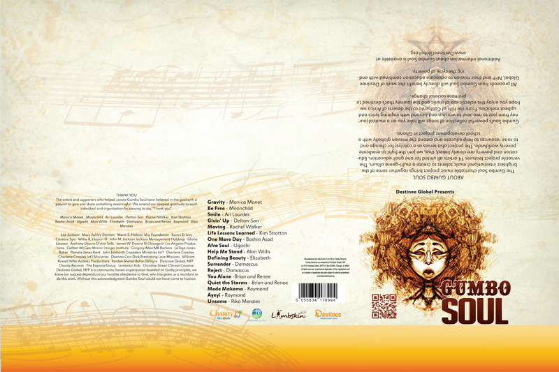
Backside of the CD.